Introduction
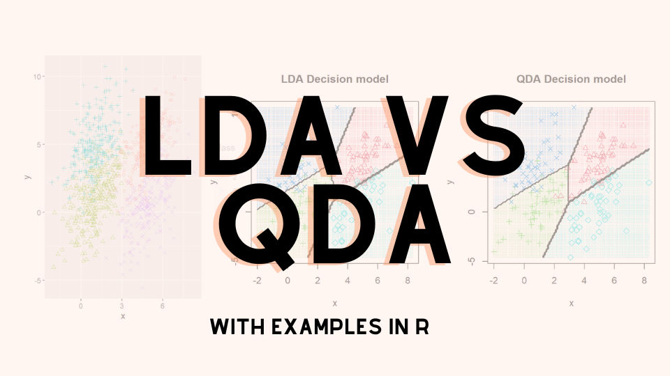
Hi everyone! This time, we will discuss about the key differences between LDA and QDA.
Both LDA and QDA are classification algorithms that are very attractive because there are no parameters to tune. However, LDA and QDA assumes that the classes we are classifying are derived from a gaussian distribution.
Both LDA and QDA is derived from a classical probabilistic models using the Bayes rule, so it is useful to recall the bayes rule:

and given that we are assuming gaussian, we have the P(x|y=k) to be the following

The main difference between LDA and QDA lies in the assumptions of the variance, if the classes shares common variance matrix, then we have LDA, otherwise, we will have QDA.
LDA
Taking the log of the posterior, and assuming they all inherits the same variance matrix, we will have for each class the following expression:

Thus, the predicted class is the class that maximizes this probability.
QDA
Unlike before, we now ommit the assumption that the variance are equal, this gives us the following probability:

Like before, the predicted class is the class that maximizes this probability.
Remark : Due to the conditional probaility is directed on x, we can ommit the P(x) part of the formula
Examples
We will use R for our examples. Below are some helper functions:
library(mvtnorm)
library(dplyr)
library(ggplot2)
library(MASS)
library(klaR)

# SOURCE: https://stackoverflow.com/questions/63782598/quadratic-discriminant-analysis-qda-plot-in-r
decisionplot <- function(model, data, class = NULL, predict_type = "class",
                         resolution = 100, showgrid = TRUE, ...) {

  if(!is.null(class)) cl <- data[,class] else cl <- 1
  data <- data[,1:2]
  k <- length(unique(cl))

  plot(data, col = as.integer(cl)+1L, pch = as.integer(cl)+1L, ...)

  # make grid
  r <- sapply(data, range, na.rm = TRUE)
  xs <- seq(r[1,1], r[2,1], length.out = resolution)
  ys <- seq(r[1,2], r[2,2], length.out = resolution)
  g <- cbind(rep(xs, each=resolution), rep(ys, time = resolution))
  colnames(g) <- colnames(r)
  g <- as.data.frame(g)

  ### guess how to get class labels from predict
  ### (unfortunately not very consistent between models)
  p <- predict(model, g, type = predict_type)
  if(is.list(p)) p <- p$class
  p <- as.factor(p)

  if(showgrid) points(g, col = as.integer(p)+1L, pch = ".")

  z <- matrix(as.integer(p), nrow = resolution, byrow = TRUE)
  contour(xs, ys, z, add = TRUE, drawlabels = FALSE,
          lwd = 2, levels = (1:(k-1))+.5)

  invisible(z)
}

# SOURCE : https://smorbieu.gitlab.io/generate-datasets-to-understand-some-clustering-algorithms-behavior/
generateGaussianData <- function(n, center, sigma, label, name= c("x", "y")) {
  data = rmvnorm(n, mean = center, sigma = sigma)
  data = data.frame(data)
  names(data) = name
  data = data %>% mutate(class=factor(label))
  data
}

generateMultiGaussianData <- function(ns, centers, sigmas , name= c("x", "y")) {
  data = data.frame()
  for (ind in 1:length(centers)){
    n = ns[ind]
    center = centers[[ind]]
    sigma = matrix(sigmas[[ind]], nrow = length(center))
    temp_data = generateGaussianData(n, center, sigma, ind, name=name)
    if (length(data) == 0){
      data = temp_data
    } else {
      data = bind_rows(data, temp_data)
    }
  }
  return(data)
}

lda_qda_pred <- function (all.data, train_ratio = 0.8){
  set.seed(0)
  train.index <- sample(nrow(all.data), round(nrow(all.data) * train_ratio))
  train.data = all.data[train.index,]
  test.data = all.data[-train.index,]
  lda.model <- lda(factor(class)~., data=train.data)
  qda.model <- qda(factor(class)~., data=train.data)

  lda.pred <- predict(lda.model, test.data)
  qda.pred <- predict(qda.model, test.data)
  lda.cm <- table(test.data$class, lda.pred$class)
  qda.cm <- table(test.data$class, qda.pred$class)
  list(LDA_model = lda.cm %>% prop.table() %>% round(3),
       QDA_model = qda.cm %>% prop.table() %>% round(3))
  par(mfrow = c(1, 2))
  decisionplot(lda.model, test.data, class = "class", main="LDA Decision model")
  decisionplot(qda.model, test.data, class = "class", main="QDA Decision model")
}
The code contains above multiple functions:
- decisionplot : Allows us to plot decision boundaries
- generateGaussianData : Generate gaussian data with a given mu and sigma
- generateMultiGaussianData : Allow us to generate multi component gaussian data
- lda_qda_pred : will give us a comparison between LDA and QDA from a given dataset
Now we will look at several examples:
Example 1 : 2 components in 2 dimensions and different covariance matrix
ns = c(500, 500)
centers = list(
  c(5, 5),
  c(1, 1)
)
sigmas = list(
  c(1, 1, 1, 4),
  c(1, 0, 0, 1)
)
dataset1 <- generateMultiGaussianData(ns, centers, sigmas)
dataset1 %>% ggplot(aes(x=x, y=y, shape=class, col=class)) +
  geom_point() +
  coord_fixed() +
  scale_shape_manual(values=c(2, 3))
lda_qda_pred(dataset1)

We purposely put the red distribution to have more variance on 1 variable with a possitive correlation between the 12 variable, this causes the decision boundary to bend in a way that it gives more area to the red distribution
Example 2 : 4 components in 2 dimensions and the same covariance matrix
ns = c(250, 250, 250, 250)
centers = list(
  c(5, 5),
  c(1, 1),
  c(1, 5),
  c(5, 1)
)
sigmas = list(
  c(1, 1, 1, 4),
  c(1, 1, 1, 4),
  c(1, 1, 1, 4),
  c(1, 1, 1, 4)
)
dataset2 <- generateMultiGaussianData(ns, centers, sigmas)
dataset2 %>% ggplot(aes(x=x, y=y, shape=class, col=class)) +
  geom_point() +
  coord_fixed() +
  scale_shape_manual(values=c(1, 2, 3, 4))
lda_qda_pred(dataset2)

As we can see given that all 4 components, we have the same number of points, and the same covariance matrix, we observe the realization of the theorem that the QDA = LDA.
Example 3 : 4 components in 2 dimensions and different covariance matrices
ns = c(250, 250, 250, 250)
centers = list(
  c(5, 5),
  c(1, 1),
  c(1, 5),
  c(5, 1)
)
sigmas = list(
  c(1, 1, 1, 4),
  c(3, 1, 1, 2),
  c(1, 1, 1, 4),
  c(5, 1, 1, 4)
)
dataset3 <- generateMultiGaussianData(ns, centers, sigmas)
dataset3 %>% ggplot(aes(x=x, y=y, shape=class, col=class)) +
  geom_point() +
  coord_fixed() +
  scale_shape_manual(values=c(1, 2, 3, 4))
lda_qda_pred(dataset3)

Unlike before, the 4 components we have now have different distributions except for the red and the green distribution which inherits the same variance matrix hence why the only decision boundary that is linear in the QDA is the one between red and the green.
Example 4 : 2 components in 4 dimensions and the same covariance matrix
ns = c(500, 500)
centers = list(
  c(5, 1, 3, 2),
  c(1, 2, 0, 0)
)
sigmas = list(
  diag(c(1, 1, 1, 4)),
  diag(c(4, 2, 3, 3))
)
dataset4 <- generateMultiGaussianData(ns, centers, sigmas, name = c("a", "b", "c", "d"))
plot(dataset4[,1:4], col=dataset4$class)
partimat(class ~ ., data = dataset4, method = "qda", plot.matrix = TRUE, col.correct='green', col.wrong='red')
partimat(class ~ ., data = dataset4, method = "lda", plot.matrix = TRUE, col.correct='green', col.wrong='red')


the QDA method generally a bit in terms of error with an average error on each dimension is 0.1115 while LDA have 0.1165
Conclusion
Main points:
- LDA and QDA are both classification algorithm.
- Both uses bayes classifier
- LDA assumes common variance matrix for all components
- LDA and QDA assumes classes are from gaussian distribution
Let me know if you have ideas of what should I write next!